Table of Contents
Introduction
Ever stared at a stock chart and felt completely lost? Those squiggly lines, bars, and numbers dancing across your screen—what do they even mean? Trust me, you’re definitely not alone here. Most new investors look at stock charts the same way I look at my teenager’s TikTok feed: confused and slightly overwhelmed.
But here’s the thing: learning to read stock charts isn’t just some nice-to-have skill. It’s absolutely essential if you want to make smart investment decisions. Think of it as learning to read the market’s mood—and once you crack the code, you’ll wonder how you ever invested without it.
Stock charts tell the story of a stock’s journey over time. They show you where the price has been, hint at where it might go, and reveal what other investors are thinking. Every spike, dip, and flat line means something. When you understand these patterns, you can spot opportunities, avoid disasters, and time your moves like a pro. And speaking of timing—getting comfortable with concepts like how to read financial statements will give you an even clearer picture of what’s really happening behind those price movements.
Let’s talk about volume for a second. (This is where things get interesting.) Those bars at the bottom of most charts? They’re not just decoration. Volume shows you how many shares changed hands, and it’s like the market’s way of showing enthusiasm—or lack thereof. Picture this: a stock price jumps 10% on massive volume versus the same jump on tiny volume. Which one would you trust more? Exactly.
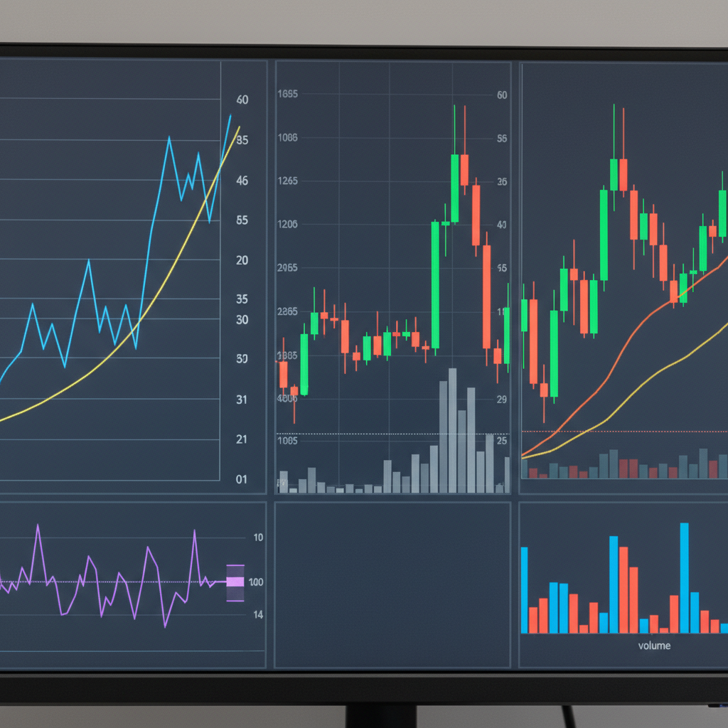
Now, you’ve got choices when it comes to chart types. Line charts keep things simple—just price over time. Bar charts give you more detail with opening, closing, high, and low prices. Candlestick charts? They’re like bar charts’ more visual cousin, and many traders swear by them. Each has its place, and you’ll probably find your favorite as you get more comfortable. Oh, and if you’re curious about the broader world of investing, understanding compound interest will blow your mind when it comes to long-term wealth building.
Here’s something cool: the skills you learn reading stock charts translate beautifully to cryptocurrency. Sure, crypto moves faster and can be more volatile, but the principles are remarkably similar. If you’re interested in exploring that world, checking out how to read cryptocurrency charts can open up a whole new set of opportunities.
What You’ll Learn in This Guide
Ready to transform those confusing charts into your secret weapon? Here’s exactly what we’ll cover together:
- Stock Chart Basics: We’ll start with the fundamentals—price, volume, and time. You’ll learn to spot opening prices, closing prices, and those crucial highs and lows that tell the real story of market action.
- Different Chart Types: We’ll explore line charts, bar charts, and candlestick charts. You’ll discover why traders love candlesticks and when a simple line chart might be all you need to spot the perfect trend.
- Analyzing Price Movements: This is where the magic happens. You’ll learn to identify uptrends, downtrends, and those frustrating sideways markets. Plus, we’ll crack the code on support and resistance levels—game-changers for timing your trades.
- Technical Indicators and Patterns: Get ready to meet your new best friends: moving averages, RSI, Bollinger Bands, and MACD. We’ll also dive into chart patterns like head and shoulders, triangles, and double tops that can help you predict what might happen next.
By the time you finish this guide, you’ll look at stock charts completely differently. Instead of seeing chaos, you’ll see opportunity. Those intimidating lines will start telling you stories about market sentiment, investor psychology, and potential profits. And if you’re wondering about the bigger picture of investing strategies, exploring long term vs short term investing will help you figure out which approach fits your goals best.
What comes next is pure hands-on learning. We’ll break down real charts, walk through actual examples, and give you the tools to practice on your own. This isn’t just theory—it’s practical knowledge you can use immediately. Whether you’re planning to day trade or build a long-term portfolio, these chart-reading skills will serve you well.
So buckle up. We’re about to turn you from a chart-confused beginner into someone who can read the market’s signals with confidence. Every successful investor had to start somewhere, and today is your day to begin mastering one of the most powerful tools in the investment world.
Want to get serious about investing? Then you need to learn how to read stock charts. Think of them as the heartbeat of the market—they show you exactly what’s happening with price movements, trading activity, and market sentiment, all laid out visually. No more guessing games. When you can read these charts, you’ll spot trends faster, recognize patterns that matter, and make smarter decisions about when to buy or sell. Sure, it might look intimidating at first (those lines and bars can seem like hieroglyphics), but once you get the basics down, you’ll wonder how you ever invested without them. Let’s break this down together and get you reading charts like a pro.
Stock Chart Basics: Understanding Core Components and Their Significance
Here’s the thing about stock charts—they’re actually pretty straightforward once you know what you’re looking at. Every chart has three main ingredients: price, volume, and time. Price runs up the side (that’s your vertical axis), showing how the stock’s value moves during whatever timeframe you’ve picked. Time stretches across the bottom, tracking those price changes over days, weeks, or months. And those bars you see at the bottom? That’s volume—basically how many shares changed hands.
Why does this matter? Because each piece tells part of the story. When you see how price action lines up with trading activity, you start to understand what investors are really thinking. Heavy trading on a price jump? That’s usually a good sign. Light volume on a rally? Might want to be careful there. Want to dig deeper into the numbers behind your investments? Check out this guide on how to read financial statements—it’s the perfect companion to chart analysis.
Now let’s talk about the specific price points that really matter: opening, closing, high, and low. (You’ll see these on bar charts and those Japanese candlestick charts everyone talks about.) The closing price? That’s gold. It tells you where all the buying and selling settled at the end of the day—like the market’s final verdict. Those volume bars I mentioned earlier? They’re your truth detector. Big volume backing an upward move means serious buying interest. Low volume on a price spike? Maybe not so reliable. The key is learning to read the price axis and time intervals together, connecting short-term wiggles to the bigger picture. And if you want to see how all this translates to actual returns, here’s a solid resource on how to calculate investment returns.
Key Aspects of Stock Chart Basics
Let’s nail down these core elements—they’ll transform how you read charts:
- Price Axis and Time Axis: Think of these as your map coordinates. The price axis shows where the stock’s been value-wise, while the time axis shows when it happened. Master these two, and you can put any price move in context—whether it’s a one-day blip or part of a bigger trend.
- Volume Bars and Their Significance: Those bars at the bottom aren’t just decoration—they’re showing you market participation. Big volume spikes often happen right before major price moves or trend changes. It’s like watching the crowd gather before something big happens.
- Opening, Closing, High, and Low Prices: These four numbers tell you everything about a trading session. How it started, where it peaked, where it bottomed out, and where it ended up. Together, they reveal whether buyers or sellers had the upper hand.
- Interpreting Volume in Relation to Price Movements: Here’s a crucial skill—volume confirms whether a price move is for real. Strong moves with weak volume? Probably won’t last. But when high volume backs a price move, you can trust it more. It’s like the difference between a whisper and a shout.
Once you’ve got these basics locked down, you’re ready for the fun stuff. Time to move from understanding what you’re looking at to actually using it for smarter investment decisions.
How to Read Stock Charts: Practical Techniques for Analysis and Pattern Recognition
Alright, now we’re getting to the good stuff—actually using these charts to make money. First things first: trends are your best friend. Is the stock going up (uptrend), going down (downtrend), or just hanging out sideways? Sounds simple, but this one skill will save you from fighting the market. Then there are support and resistance levels—think of them as the floor and ceiling where stocks tend to bounce. Master these concepts, and you’ll know when to jump in and when to bail out. Need some broader investment context? This guide on investment diversification strategies shows how chart reading fits into building a solid portfolio.
But wait—there’s more. (I know, I know, sounds like an infomercial.) Technical indicators add another layer of insight that can really up your game. Moving averages smooth out the noise and show you the real trend. RSI tells you when a stock might be overbought or oversold. Bollinger Bands show you when prices are getting extreme. MACD helps spot momentum changes. Sounds complicated? It’s really not. Start with just one or two indicators—don’t try to use everything at once or you’ll end up more confused than when you started. And if you’re looking at dividend stocks, understanding how to calculate dividend yield adds another dimension to your chart analysis.
Key Aspects of Reading Stock Charts
These practical techniques will take your chart reading to the next level:
- Identifying Trends: Look for the pattern—higher highs and higher lows mean uptrend, lower highs and lower lows mean downtrend. Sideways? The stock’s taking a breather. Once you can spot these patterns, your timing gets so much better.
- Support and Resistance Levels: Find those price levels where stocks keep bouncing—like invisible barriers in the market. When a stock breaks through resistance, it often keeps running. When it hits support, it usually bounces back up.
- Volume’s Role in Confirming Trends: This is where you separate the real moves from the fake ones. High volume supporting a price move? That’s conviction. Low volume during a rally? Might be running out of steam. Always check what volume is telling you.
- Utilizing Technical Indicators: Start simple—maybe a moving average to spot trends and RSI to catch overbought conditions. As you get comfortable, add MACD for momentum signals. The key is understanding what each indicator actually measures, not just blindly following signals.

You’ve just taken a huge leap forward in your investing game. Reading stock charts isn’t just about squiggly lines and numbers—it’s about understanding the story behind every price movement. Think of these charts as a visual diary of what investors were feeling and doing at any given moment. You can now spot uptrends, identify those crucial support and resistance levels, and make sense of technical indicators like moving averages, RSI, and Bollinger Bands. That’s no small feat! You’ve moved from throwing darts in the dark to making informed decisions based on real data. And knowing the difference between line charts and candlesticks? That’s like having the right tool for every job.
Here’s what I want you to remember: every chart tells a story. It’s the story of fear, greed, hope, and panic—all playing out in real time. Learning to read these emotional patterns takes practice. (Trust me, I’ve stared at more charts than I care to count.) But here’s the reality check—no indicator is a crystal ball. Charts are powerful, but they work best when you combine them with solid research and a clear strategy. The beauty of investing is that it’s a marathon, not a sprint. Each chart you analyze teaches you something new, sharpening your instincts and improving your timing.
Ready to level up even more? Let’s talk next steps. First, you’ll want to explore investment diversification strategies—because putting all your eggs in one basket is never a good idea. Spreading your investments across different assets can help manage risk while boosting your potential returns. Next, dive into our guide on how to calculate investment returns. You’ll learn the essential formulas and techniques to track how well your portfolio is actually performing. If you’re wondering about your investment timeline, understanding long term vs short term investing will help you pick strategies that match your goals and risk tolerance. And here’s something that’ll blow your mind: grasping the power of compound interest shows you how your money can actually make money over time. It’s like having your investments work while you sleep.
You’ve got the knowledge. You’ve got the tools. Now it’s time to put them to work. Success in investing isn’t just about what you know—it’s about taking action and never stopping the learning process. Don’t be afraid to dive in, trust the skills you’re building, and lean on reliable resources when you need them. The investing world is full of opportunities to build real wealth and hit your financial goals. You’re ready for this.
Frequently Asked Questions
-
What is the best type of stock chart for beginners?
- Candlestick charts are often recommended due to the detailed price information they provide.
-
How can I tell if a stock is trending upward?
- Look for a series of higher highs and higher lows on the chart to identify an uptrend.
-
What does high trading volume indicate?
- High volume often confirms the strength of a price movement or trend.
-
Are technical indicators always accurate?
- No, they are tools that should be used in conjunction with other analysis methods.